Turbo Milano: interview with Architect Davide Gernone
03 febbraio 2021
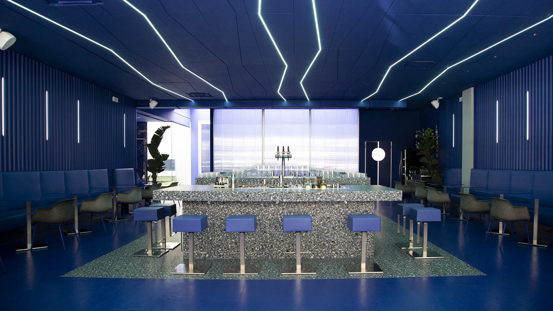
A completely original, innovative, sustainable and... blue project! Turbo Milano is a contemporary mixology bar that stands out for its unique space. We put a few questions to Architect Davide Gernone, who oversaw the project.
Tell us about the Turbo project: what was the idea behind this new spatial concept?
Turbo was born from a desire to rethink the concept of dining and the way we experience it, framing it in a space that revisits its various aspects. The central bar open on both sides becomes the stage. The stylish decor with fine, elegant finishes forms the backdrop for the diners with the technological details completing the atmosphere. It is no surprise that the project stems from the partnership with Acapulco, a leading Milanese communication and lifestyle company.
Different souls coexist in the same environment. How did you manage to divide the spaces with the ceramic material?
The original plan of the space helped us to create two completely identical environments. One volume is dedicated to the restaurant and includes the monolithic bar covered in ceramic material. The continuity of the material gives the complex a sculptural charm. Meanwhile, in the wing reserved for the offices, the ceramic material forms a kind of welcome carpet, rising up to form the reception desk. In both cases, albeit with different objectives, the material element constitutes a focal point both for users of the restaurant and visitors to the offices.
Medley by Ergon reconciles technical performance with strong aesthetic impact. What characteristics of the collection did you appreciate during the project?
Turbo is a combination of innovation and tradition, just like the grits design of the Medley by Ergon collection, in the Classic version, an original take on “Venetian terrazzo”: this was one of the starting points of the entire project. Blue was the only realistic colour choice. We were also impressed with its exceptional technical qualities, essential for covering the main bar. In addition, the 90x90 size proved particularly versatile for both vertical and horizontal surfaces.
The monochrome colour scheme in shades of blue strikes you as soon as you walk in. What was the thinking behind this style choice?
Developing a restaurant project with a monochrome colour scheme is definitely a challenge. More specifically, we chose Klein blue, in honour of the famous artist. It is a very full and strong pantone, vibrant but enveloping, which embodies the personality of the establishment and the look & feel we wanted to create. We wanted people to feel like they have been catapulted into a parallel dimension so we used a single tone of blue for every wall, surface and accessory, leaving lights, shadows and perspectives to create the rest of the atmosphere. Moreover, blue is rarely associated with the restaurant sector, and this makes it another distinctive trait.
Turbo is an innovative project also because of the “ethical” choices adopted, not just in the design phase. Will the themes of environmental sustainability and energy savings become increasingly important in architecture?
Nowadays I don’t believe is possible to approach a hospitality project without considering its impact on the environment. From the outset, the energy efficiency of the structure was a key aspect of the design project. Every “green” choice made during the design of Turbo is geared towards protecting the establishment.
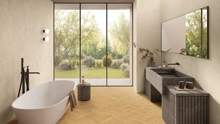
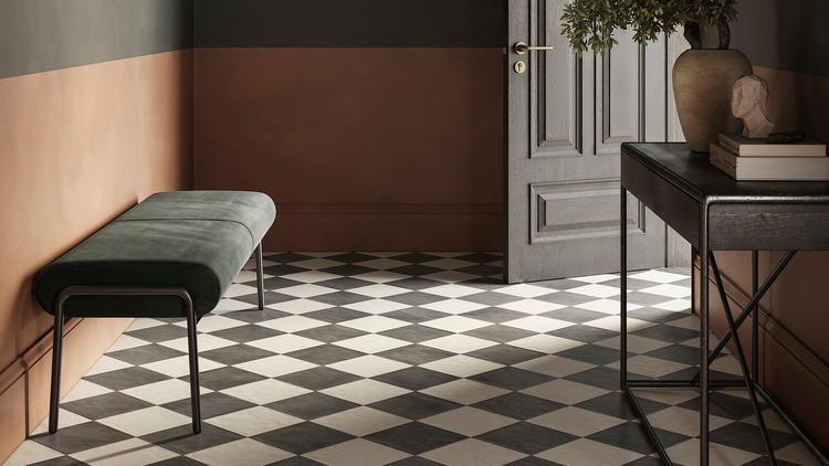
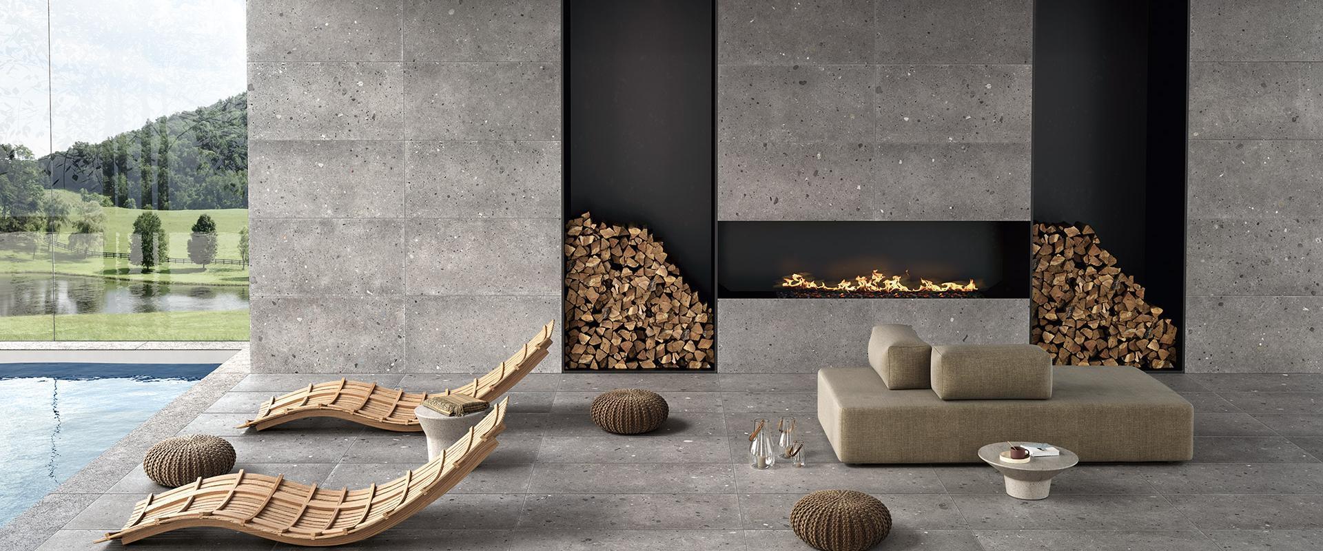
Collections used in the project

Related Articles

Any Questions?
If you are looking for the ideal covering for your home or business or you have any questions about our collections, don’t hesitate to get in touch! Together we’ll find your perfect bespoke solution!
If you are looking for the ideal covering for your home or business or you have any questions about our collections, don’t hesitate to get in touch! Together we’ll find your perfect bespoke solution!
Enter the Emilgroup world!
Stay up to date with the latest news from the world of ceramics. Find out about our new collections, events and innovative applications of porcelain stoneware.