Pastel tiles: how to use them and combine them
27 luglio 2022
Antique pink, sage green, avio blue, baby blue. Pastel tiles are some of the most popular design trends of 2022. Pastel-colored tiled walls and floors are an excellent idea to bring a touch of color into the home and give rooms a relaxed, tranquil atmosphere. There are two color parameters typical of pastel tiles – high luminosity and low saturation – the ideal combination for a color which takes a leading role but is still relaxing and balanced. When choosing the tile color for your home, pastel colors meet a key requirement of the moment: the promise of a relaxing and harmonious environment.
The last couple of years have made us see our domestic living environment in a different light. The importance of a home which provides serenity and balance has become a priority: a refuge from the chaos and uncertainty of the outside world. Pastel tiles fully meet this requirement, offering balanced nuances nevertheless in keeping with the most refined design tastes. Vibrant, contemporary design, which moves from color to our daily lives, our wellbeing, our way of living and thinking about domestic spaces.
Colored tiles for the home
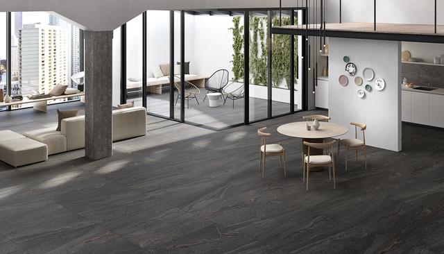
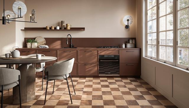
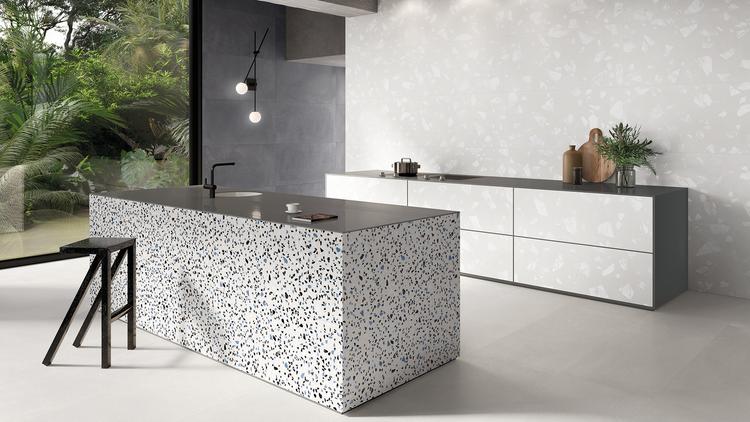
The choice of color for tiles for the home is essential in establishing the atmosphere of the different rooms. Colored tiles reflect and drive the personality of the inhabitants, increasing the aesthetic possibilities for the different rooms. The first thing to consider is the color temperature: warm undertones – ideal for living areas and the kitchen – convey energy, a welcoming feeling, creative inspiration; cool undertones, on the other hand – suitable for sleeping areas or for sober and refined living areas – have a relaxing and soothing effect. Aesthetic sensations which have an influence not only on the rooms themselves, but also the mood and wellbeing of the residents. This equilibrium is the compass for choosing harmonious colored floor and wall tiles – pastel tiles are an excellent choice here, as they provide the vivacity and character of color, without ever being tiring to the eyes, thanks to their essential, natural nature, free from eccentricities and complexities.
The authenticity of Sixty by Emilceramica is ideal in this regard. This collection celebrates the first 60 years of the group, and interprets the tactile power of clay in the most iconic colors of Italian high design, molding it into simple yet refined pastel colored tiles. Sixty is an exaltation of genuineness: shapes, color, lights free of any superstructure, the intimate and precious gesture of essentiality. For each decade from Emilgoup’s foundation in 1961 through to the modern day, Sixty offers a different core color. From the pastel Fango tiles of the 1960s through to the future promise of Sabbia from 2021, passing through Salvia from the 1980s and the intensity of Antracite floor tiles from the early 2000s. This collection is able to dress up any room with refinement and personality, in two different variants. The Fondo (plain) version: surface patterning, soft, silky feel, and comfortable, anti-slip properties thanks to SilkTech technology. The Timbro (stamped) version: an interplay of three-dimensionality and dynamism for audacious and creative combinations, in both color and volume.
How to choose colored tiles for terraces and balconies
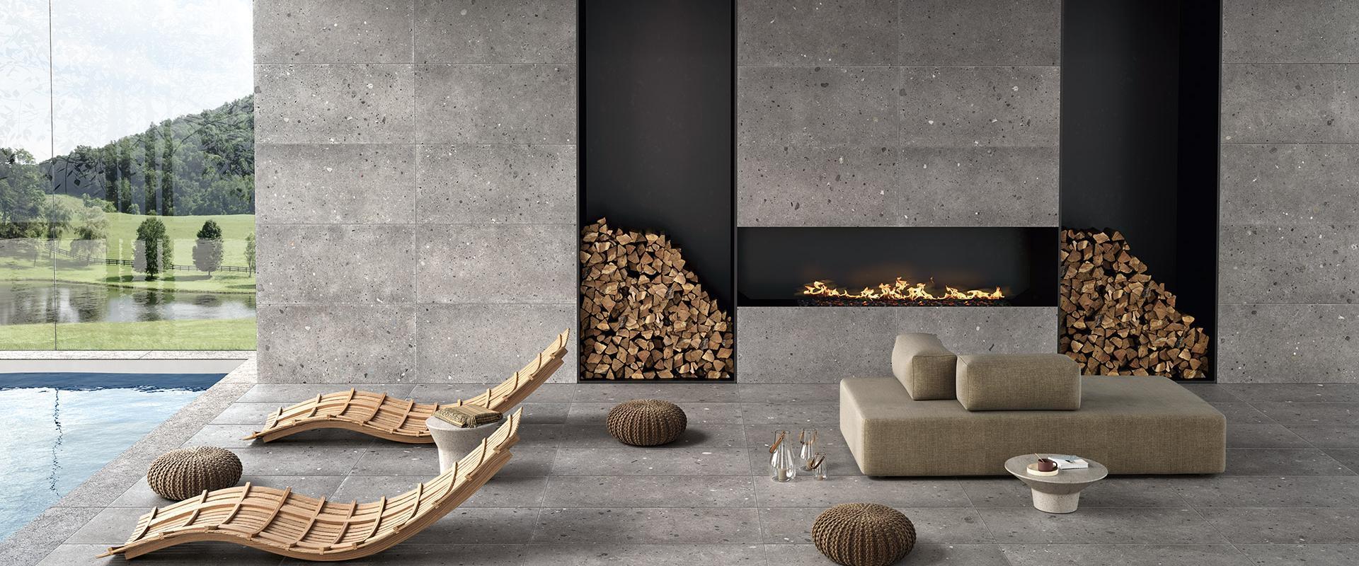
Outdoor spaces are also ideal for the contemporary charm offered by colored tiles. The benefits of pastel colors do not end inside the house, they also apply outdoors: colored tiles for terraces and balconies are becoming more and more popular.
Terraces, balconies and the like are ideal spaces for experimentation, for expressing personality without the design limitations which can be present inside the house. They are versatile, dynamic environments often perfectly suited to colors.
Here are some of the most popular solutions for choosing the most suitable tiles for terraces and balconies. Shades of red are an audacious choice which can be refined by choosing pastel colors, in order to warm up the area and contrast with the cool of the outdoors – for example the familiar and intimate sensations offered by terracotta colors, the solidity of brick, and amaranto and ciliega reds. On the opposite end of the color spectrum, shades of dark blue and green are an elegant and refined choice for colored floors in outdoor areas, ideal for conveying a feeling of calm and harmony, for a balcony or porch in which relaxation takes a leading role alongside urban and modern esthetic taste.
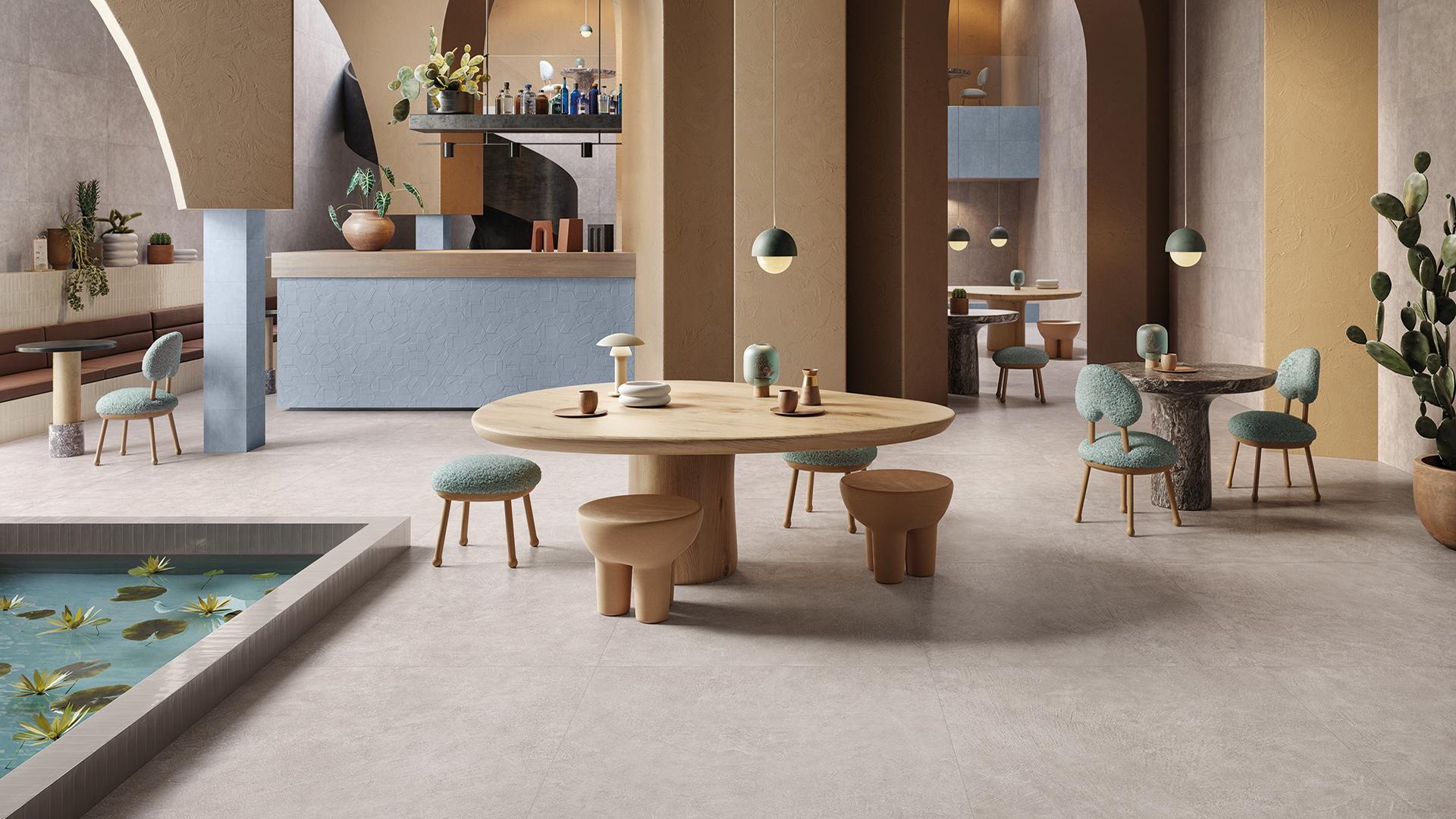
Pastel colored tiles in commercial locations: the success of an international trend
Pastel colored tiles are a winning design both in residential and commercial environments. The desire for a relaxing, balanced and harmonious environment also applies to the walls and floors of shops, boutiques and other commercial premises.
From a marketing perspective, it is key to provide a positive sensation to customers, and the chromatic balance of pastel colors provides an excellent background to make people (and customers) feel at ease. Pastel colors are not limited to wall and floor tiles, but can also be used on countertops, shop counters and display surfaces. Pastel colored porcelain stoneware tiles are an excellent choice for commercial premises due to the technical properties of the material: it is resistant to impacts and wear from foot traffic, is anti-slip and easy to clean, as well as providing almost limitless esthetic possibilities.
The perfect balance between technical performance and design is provided by the colored tiles in the TotaLook by Emilceramica collection: a range with an urban spirit which offers resin and brick finishes to create original and exclusive surface coverings. Resin becomes the raw material of a unique ceramic experience, ideal for creating colored flooring with great personality and a real vocation for design. The catalog features five different colors and three decorative versions to explore all the color and material properties of resin.
How to combine pastel flooring and walls
Pastel flooring is an excellent starting point for selecting the temperature of the room, in order to set the stage for the widest range of design projects, from the most classical to the most theatrical. Choosing tiles in pastel shades expresses the personality of the color without being too overbearing in terms of the esthetic economy of the environment.
Let’s take a look at some of the most effective colors and combinations to bring out the best in an environment.
Light blue is a very on-trend color, in the baby blue or avio blue avio shades. Combining pastel flooring in these tones with neutral white or cream colored walls makes the space feel bigger and fresher, evoking the element of water as well as being very on-trend. Dark green matches perfectly with a gray wall or with wooden finishes and cladding. Pink color tiles are excellent for creating a shabby chic environment, in combination with white and lighter grays. The general tip when choosing colored floors is to pay attention to the color balance, staying within the wide range of possibilities offered by neutral colors in terms of the walls, or making use of complementary colors for a more spectacular effect.
Pastel colored tiles have the advantage of allowing for knowing design choices in any environment, bringing with them brightness, new esthetic possibilities and harmony.


Related Articles

Any Questions?
If you are looking for the ideal covering for your home or business or you have any questions about our collections, don’t hesitate to get in touch! Together we’ll find your perfect bespoke solution!
If you are looking for the ideal covering for your home or business or you have any questions about our collections, don’t hesitate to get in touch! Together we’ll find your perfect bespoke solution!
Enter the Emilgroup world!
Stay up to date with the latest news from the world of ceramics. Find out about our new collections, events and innovative applications of porcelain stoneware.