Warm tile colors: all you need to know

07 settembre 2022
A new horizon is opening up amongst the most refined interior design trends: warm tile colors. And the palette of reference is, indeed, that of the horizon: the nuances of the sky at sunset, the color of the sun. From yellow to red, passing through peach and orange nuances, these shades take a leading role in welcoming, familiar environments which invite us to come in and live in harmony with the space, through the creation of floors which are able to increase the warmth of the entire room and offer a new perspective on the furnishing. Unlike trends involving interplays of cold and metallic color tones, warm colored floors never run the risk of creating an austere and detached atmosphere – quite the contrary, they are the ideal base for a room designed to be lived in with passion, warmth and feeling.
The temperature of the rooms plays an important role both in the design of the furnishings and in the emotional perception of the space. As regards the interior design, these solutions are versatile and easy to combine with walls and furniture. From the point of view of the atmosphere, they convey intensity, passion, strength, and precious energy to live the space with joy and determination.
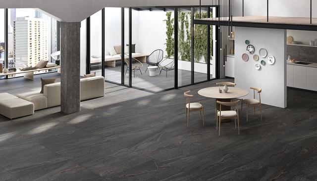
In terms of floors, we can make reference to the wider range of possibilities offered by the new porcelain stoneware solutions. Warmth can also be expressed through the right color choice of stone-effect and wood-effect tiles, as well as solid colors, from the subtlest to the boldest and brightest.
The leading shade of this range tiles is undoubtedly red. An audacious choice which offers hints of character and lends itself to combinations with more neutral colors in order to create refined, ultra-modern effects. Red tiles immediately emanate warmth into the environment, while expressing strength and passion; they take a leading role, while at the same time lending themselves to dialogue with other interior design elements.
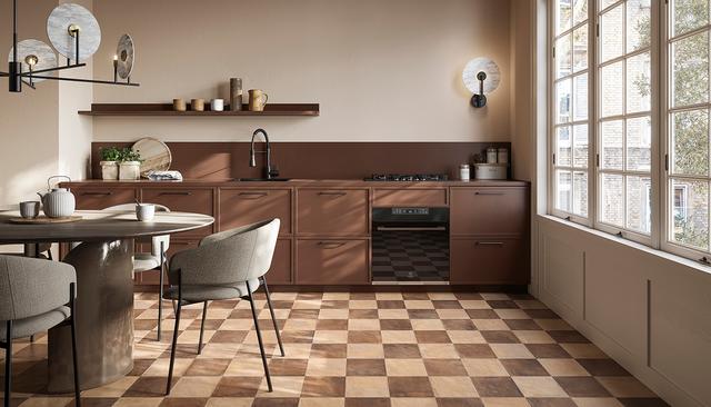
Brown tiles are also an increasingly well received choice for the design of warm colored flooring. A versatile, elegant and sober color, brown is becoming a symbol of tradition and refinement in more modern environments. A great classic which makes reference to nature, authenticity, evocations of the land and wood, and lends itself to the widest range of design styles and interplays with great class. In the palette of welcoming color tones, brown is a rewarding choice thanks to how easy it is to find combinations, without ever giving up on the captivating effect that these shades are able to convey.
Warm colored floors for every environment
A wide-ranging palette, packed with different shades, materials and finishes. To furnish every environment with style and personality, it is advisable to find the tiles best suited to the design requirements and environment.
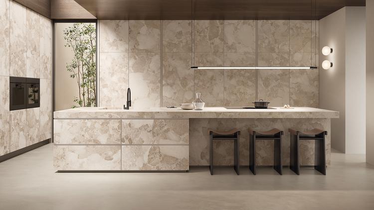
Warm colored floors for living areas can explode with all shades of yellow, orange and red. It is a bold choice which, when balanced with mid- or neutral-toned walls and a furnishing style which enhances the stylistic direction, creates a refined, modern effect. Derived colors such as cherry or crimson are perfect for a modern kitchen, to be furnished with a focus on light shades or even a refined and timeless white.
With a little attention, the same colors can also be used successfully in bedroom areas, taking care not to go overboard with the color temperature, however. The element of warmth – and therefore of energy, ardor and proactiveness – must be tempered, lowered in its intensity, to adapt to a more visually relaxing mood: prune or mallow, for example. Remember that we are not only talking about solid colors, but all materials with warm subtones, including some stone-effect tile solutions.
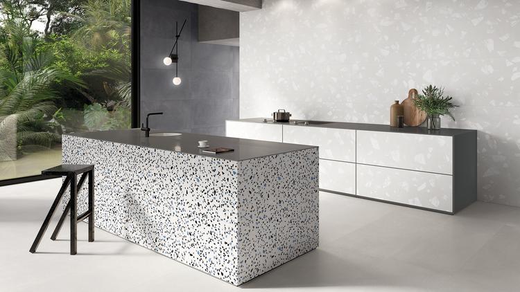
From this perspective, Unique Travertine by Provenza is a valuable solution – the perfect combination of the texture of travertine and contemporary taste, between the soft tone and design finish. It is a collection which reinterprets the calcareous charm of this stone through design and production faithful to its vein patterns, structure, and spirit. Unique Travertine tiles are ideal for designing warm colored floors, without having to give up the evocative power of this limestone. If you think that stone is cold and unforgiving, the Chocolate and Cream colors in particular will make you change your mind!
Warm colored bathroom tiles
In bathrooms too, warmer and more embellished shades – above all those which are hybrids of natural or dark colors blended to reach shades of violet – give rise to high-impact, refined solutions. Combining bathroom tiles in more welcoming colors and contrasting furniture and sanitary fixtures is an excellent solution for rebalancing the overall temperature of the environment. A material you should always take into consideration when opting for natural bathroom tiles is undoubtedly wood. It indeed offers a perfect interpretation of warm tones – in terms of its most ancestral dimension, the perceptions of fire, the warmth emanated by the wood – and for this reason, wood effect tiles are an excellent ally when designing a bathroom with welcoming nuances.
A great source of inspiration is Alter by Provenza: all the centuries-old power of oak, wrapped up in tiles which clad the most refined surfaces with class and character. The most refined oak meets colored resin inserts in an unprecedented gesture of authenticity and originality. The result is a collection of warm and intimate tones, ideal for the walls and floors of contemporary environments. Alter tiles are available in four iconic color variants – Sbiancato, Miele, Noce and Bruciato – and also available in the Incontro decor, a high-impact composition of resin and end-grain wood.
The best warm colors for your floors
The key to choosing the most suitable tiles is identifying the reference style and the atmosphere we wish to give the environments. Choosing warm colors means a palette full of character and possibilities. Let’s take a look at some of the most popular nuances for flooring design.
Starting out with red is mandatory. This is the first color we think of when talking about warmth, fire, color intensity and emotions. It evokes passion, energy, creativity and the spirit of initiative – if you want to bring these characteristics into your living space, red will undoubtedly be a source of inspiration. An energetic and decisive color, which lends itself particularly – above all in its purest shades – to living areas or to delimiting a smaller area within an environment dressed in more neutral tones.
Yellow is the primary color which, alongside red, forms the pair of warm colors. It is an excellent choice for visually expanding spaces – particularly less generous ones – and for bringing light into living areas. It conveys cheer and lightheartedness, vital energy, and pairs effectively with browns and darker tones.
Orange, which has returned to the interior design panorama over the last year, is now particularly on-trend. Once a favored color of noble residences, today it conveys a chic and sophisticated touch to interiors.
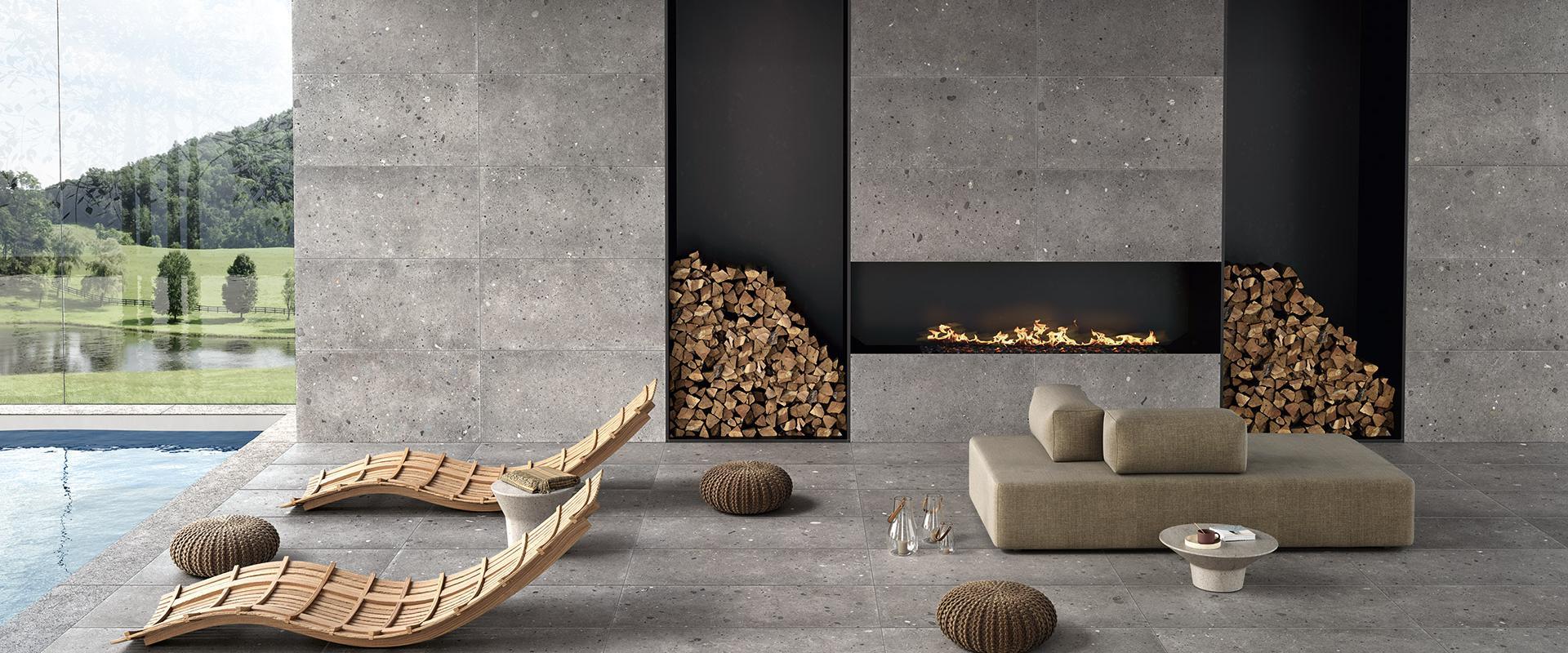
The naturalness and versatility of brown tints should not be undervalued, in addition to warm materials such as wood, terracotta-effect tiles – which convey a uniquely intimate, warm and artisanal dimension – and also the possibilities offered by stone-effect floors, such as the Landscape by Emilceramica tiles. Completely inspired by limestone, this collection brings together the legacy of stone – molded by the profiles of cathedrals, sculptures and ancient villages – to offer it to refined, contemporary horizons. Landscape expresses linearity and elegance, minimalist refinement. Avorio, Cenere, Sabbia and Antracite are the color variants, enhanced by the Rigato decor – everything necessary to bring the charm and appeal of stone into living spaces, in a warm, intimate family dimension.
Collections used in the project


Any Questions?
If you are looking for the ideal covering for your home or business or you have any questions about our collections, don’t hesitate to get in touch! Together we’ll find your perfect bespoke solution!
If you are looking for the ideal covering for your home or business or you have any questions about our collections, don’t hesitate to get in touch! Together we’ll find your perfect bespoke solution!
Enter the Emilgroup world!
Stay up to date with the latest news from the world of ceramics. Find out about our new collections, events and innovative applications of porcelain stoneware.